Documentation
The site is built using Wordpress, a very popular Content Management System for millions of websites worldwide. This guide will walk you through how to edit your website using the back-end editor. Whether you want to create pages, update text, swap out images, or adjust page layouts, step-by-step instructions will help you make changes confidently with no coding experience required.
Remember you can always reach out for support if you get stuck.
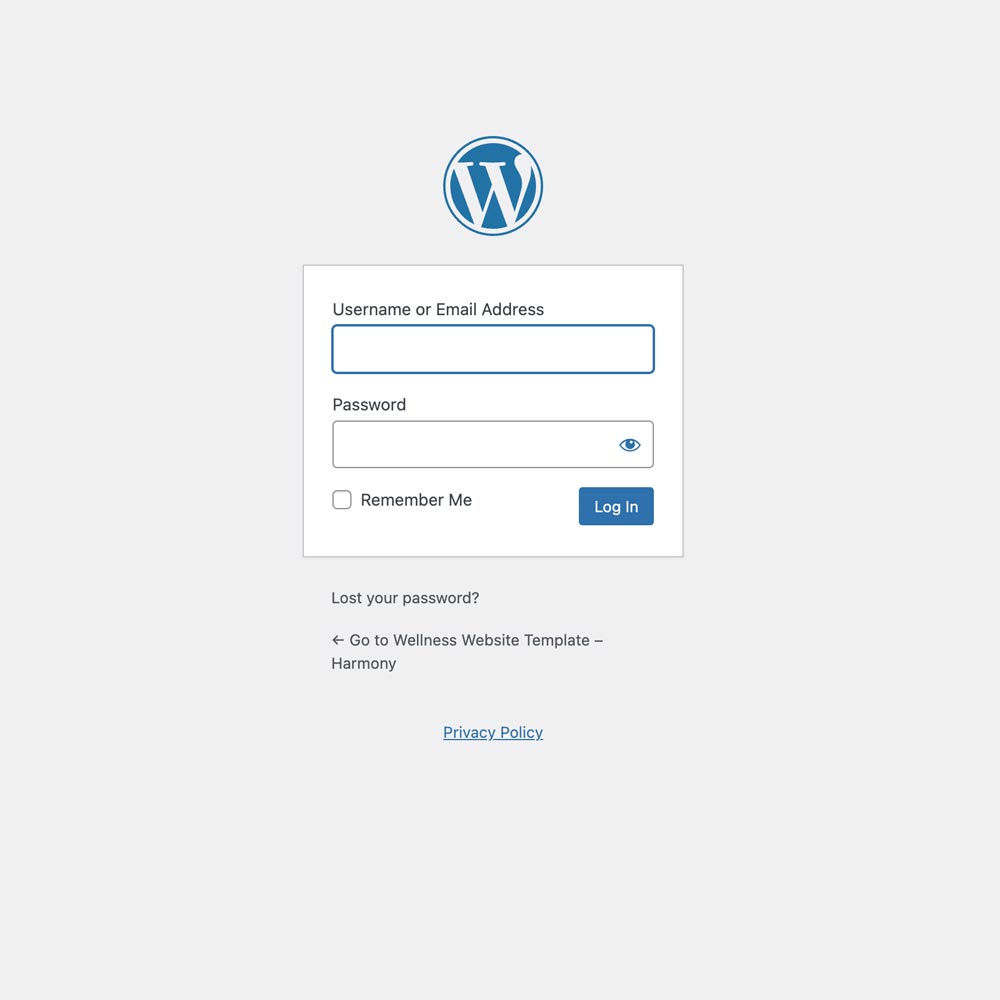
Logging into the back-end
In the browser enter your domain name then /dashboard.
for example https://your-domain-name.com/dashboard.
Resetting your password
If you have trouble logging in you may need to reset your password.
Click here for more information on resetting your password.
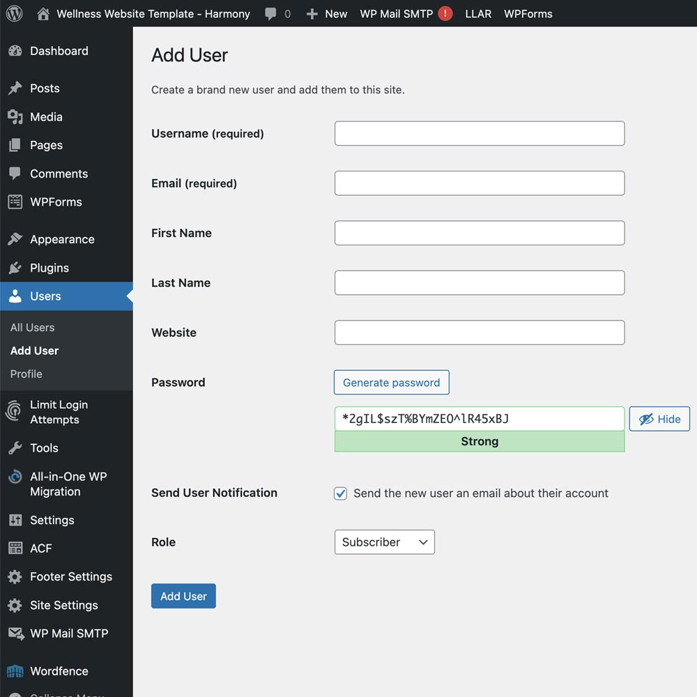
Adding new users
In the sidebar on the left navigate to Users > Add User.
This screen allows you to add new users who can login to your site.
Click here for more information on adding new users.
User roles
You will most likely only need the use of these roles:
- Administrator
somebody who has access to all the administration features within a single site. - Editor
somebody who can publish and manage posts including the posts of other users. - Author
somebody who can publish and manage their own posts.
Click here for more information on user roles.
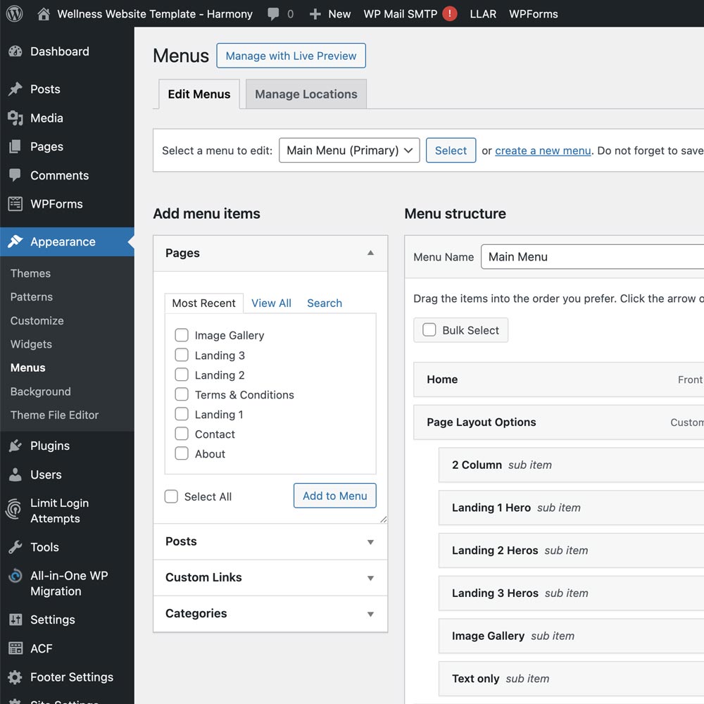
Adding and editing menus
Menus can be created and edited via Appearance > Menus.
This allows you to edit any menu, add new pages and re-order the menus.
Click here for more information on menus.
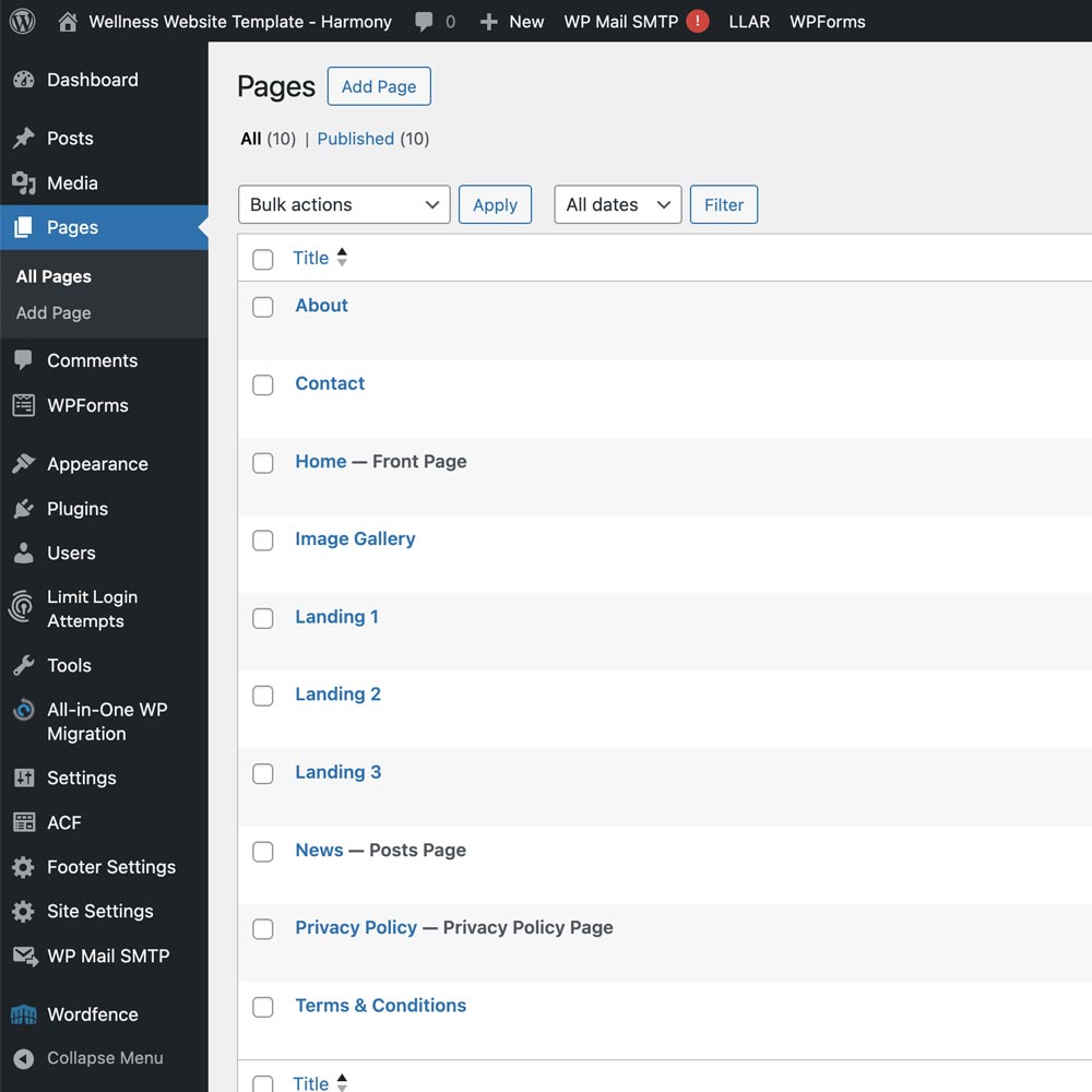
Adding a new page
In the sidebar on the left navigate to Pages > Add Page.
Give the page a title then in the right hand side under Template select Page Builder and click publish in the top right.
This allows you to add the component blocks to build your page. See 'Creating pages' below.
Editing a page
To edit a page click on the page name or hover over it and click on 'Edit' underneath.
Click here for more information on adding and organising pages.
Duplicating a page
If you have an existing page you would like to clone as a starting point, you can clone a page. Hover over the page name you would like to duplicate, click on Clone underneath. From there you can edit the page name and content, publish the new page and re-order the components.
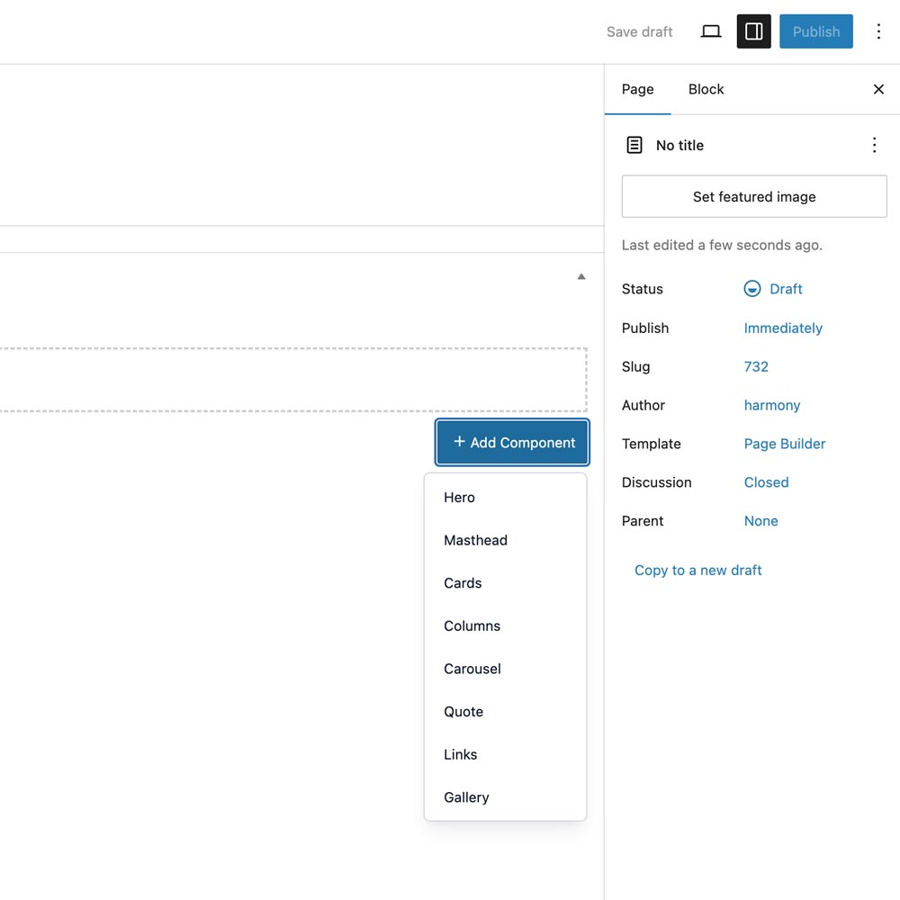
Building your new page
Once you have added a new page and selected Page Builder under the Template drop-down on the right hand side, you will see an area with a button Add Component.
Here you can add components to the page and re-order them by dragging up and down.
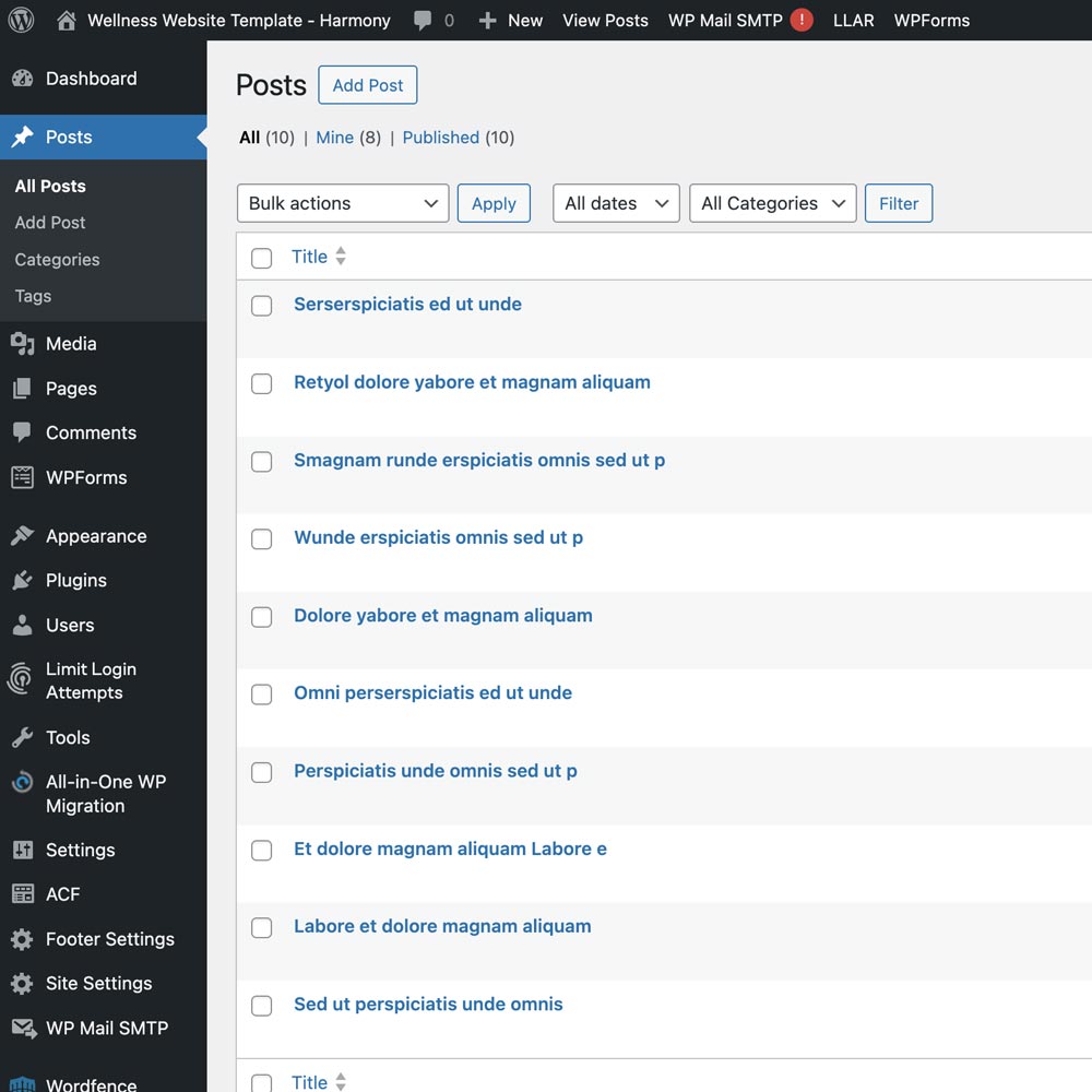
Adding a Blog post
In the sidebar on the left navigate to Posts > Add Post.
Give the post a title then add your content in the block below this and click publish in the top right.
Click here for more information on the post screen.
Editing a post
To edit a post click on the post name or hover over it and click on 'Edit' underneath.
Click here for more information on editing posts.
Duplicating a post
If you have an existing post you would like to clone as a starting point, you can clone a post. Hover over the post name you would like to duplicate, click on Clone underneath. From there you can edit the post name, content and re-publish the post.
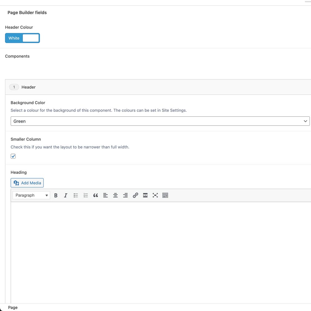
Editing a Header component
This component can be used for the first section of a web page where you want a block colour or image background and extends about a third of the way down the page.
Expand the section and you will see the optional content areas which are labelled:
- Background Color
you can change the background color of the whole strip. - Background Image
the image that will fill the header section, this overrides the background color. - Fixed Image
the option to fix this image so it stays in place as you scroll down the page. - Smaller Column
unchecked this will make the heading fill the width of the browser, checked and the width will be smaller. - Heading
the main section heading, you can have multiple lines here.
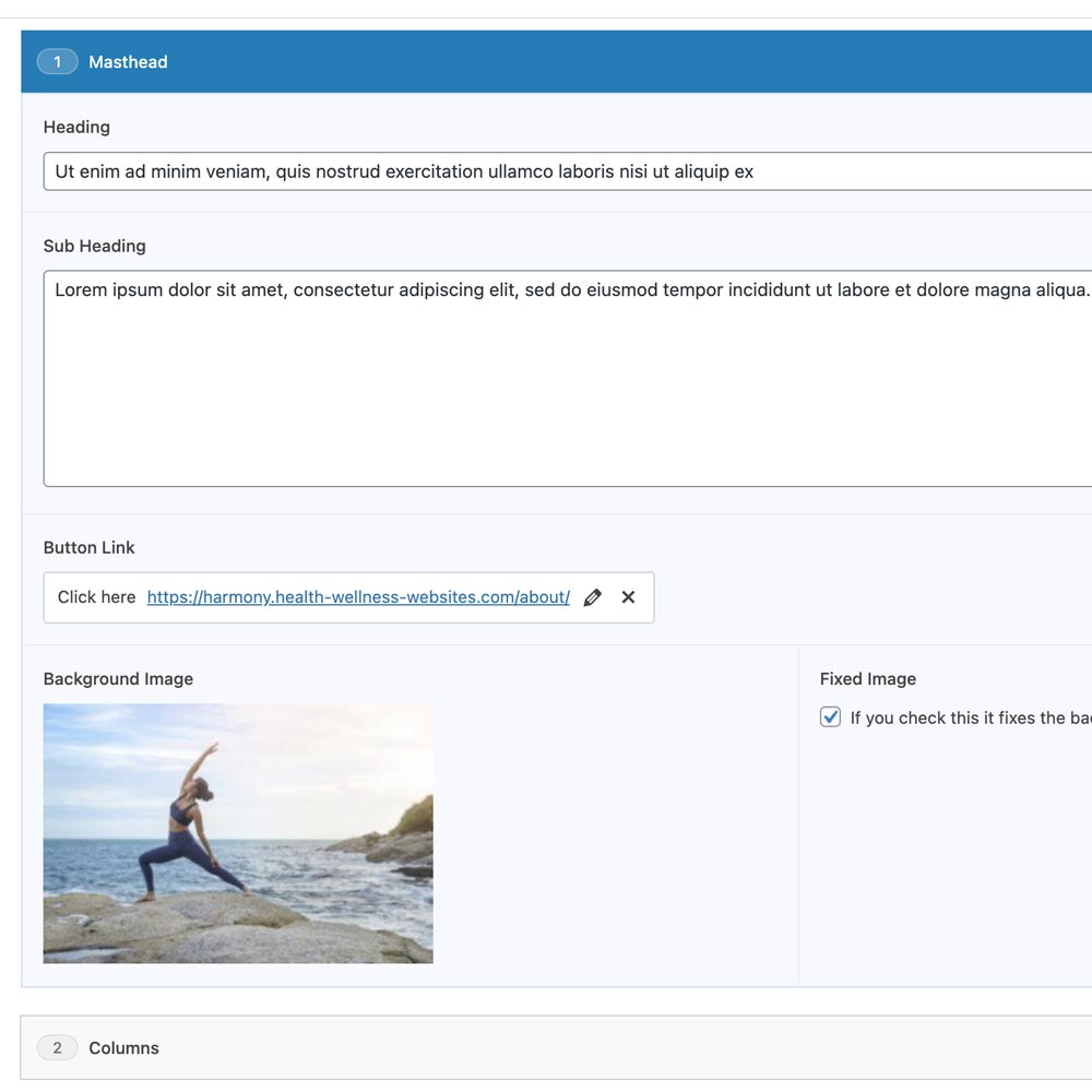
Editing a Masthead component
This component can be used for the first section of a web page where you want a full screen image with an introduction and possibly a button.
Expand the section and you will see the optional content areas which are labelled:
- Heading
the main heading for the page or website. - Sub Heading
a sub-heading so you can add a more detailed introduction. - Button Link
a button to link to another page, another part of this page or to an external link. - Background Image
the image that will fill the browser window. - Fixed Image
the option to fix this image so it stays in place as you scroll down the page.
Click here for more information on images.
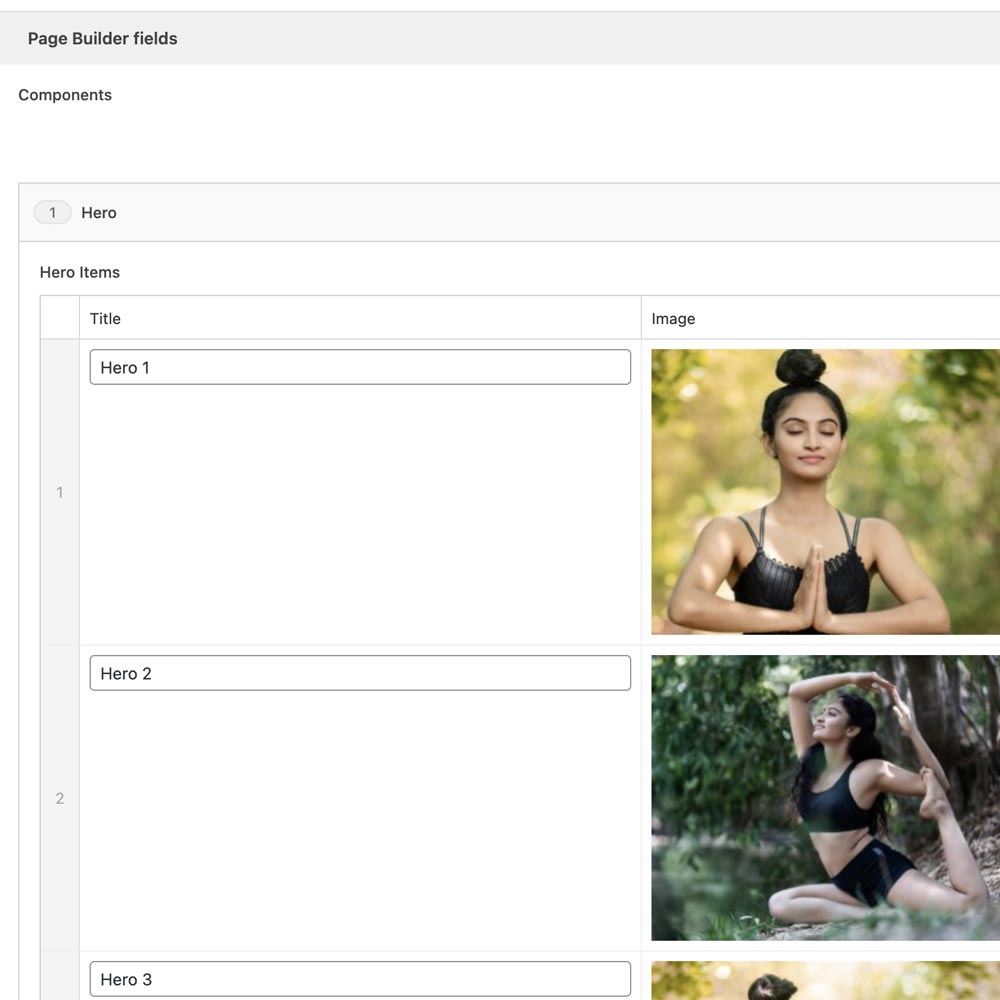
Editing a Hero component
This component can be used to showcase up to 3 main, or 'hero' areas of your website.
Expand the section and you will see the optional content areas which are labelled:
- Hero Items
you can add up to 3 of these. - Title
a heading for the hero area. - Image
the background image that will fill that hero. - Link
a link that will link the whole hero area to another page, another part of this page or to an external link. - Fixed Image
the option to fix this image so it stays in place as you scroll down the page.
Click here for more information on images.
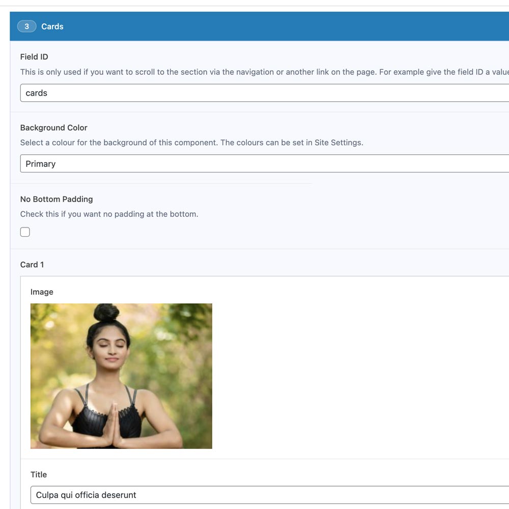
Editing a Card component
This component can be used to showcase up to 3 cards of content.
Expand the section and you will see the optional content areas which are labelled:
- Field ID
add a value here if you want to link directly to this section. - Background Color
you can change the background color of the whole strip. - Smaller Column
unchecked this will make the cards fill the width of the browser, checked and the width will be smaller. - Small Top Padding & No Bottom Padding
these are useful if you want multiple rows of 3 cards, so you can make them closer to each other.
Then within each Card area you will see the optional content areas which are labelled:
- Image
these sit at the top of the card and all images need to be the same size if you want them to appear level with the other card images. - Title
the card title, this is alos displayed on the popup if you choose that for a CTA below. - Text
the card content. - CTA
the option to add a link to another page or external url, or to add a link to a popup window. - Popup Button Text
if you choose popup, this is to message shown in the button. - Popup Content
if you choose popup, this is to main body of text in the popup window.
Click here for more information on images.
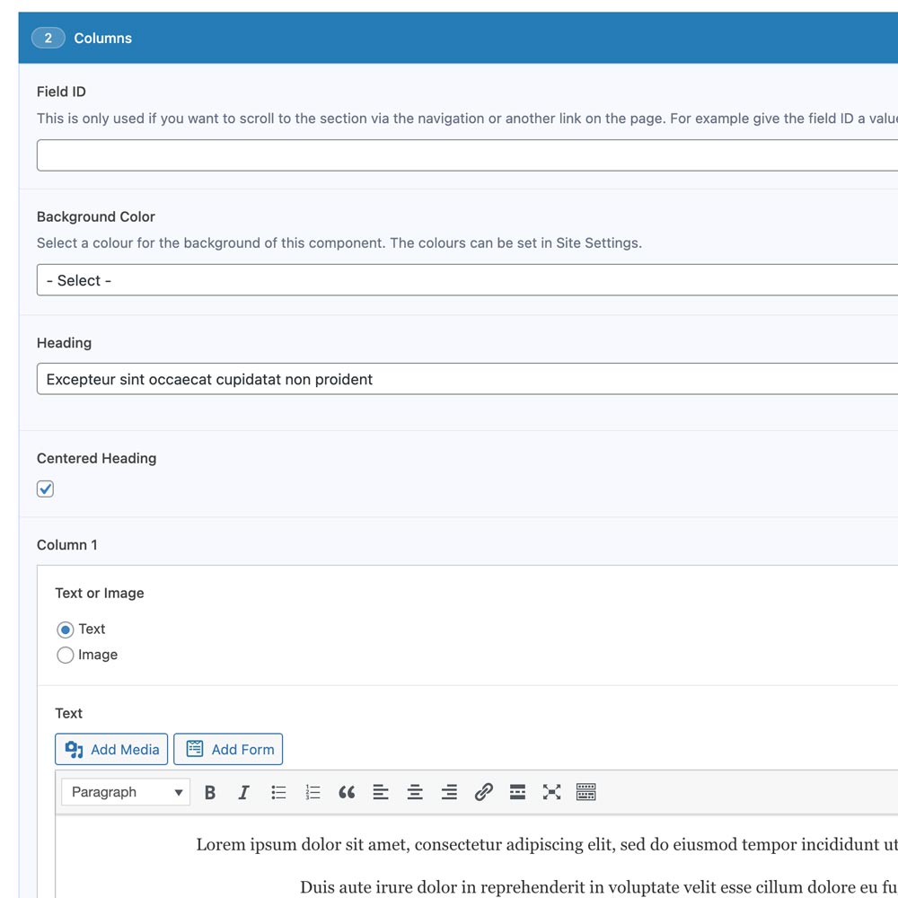
Editing a Columns component
This component can be used to showcase up to 2 columns of content.
Expand the section and you will see the optional content areas which are labelled:
- Field ID
add a value here if you want to link directly to this section. - Background Color
you can change the background color of the whole strip. - Smaller Column
unchecked this will make the cards fill the width of the browser, checked and the width will be smaller. - Heading
the main section heading. - First Heading
check this if your columns component is the first on the page, this ensure the heading is an H1 tag, great for SEO. - Centered Heading
the title is left aligned by default, this centers it.
Then within each column area you will see the optional content areas which are labelled:
- Text or Image
option to have an image or text. - Image
if Image is selected then you will see an image upload button. - Text
if Text is selected then you will see an text area. - Button Link
if Text is selected then you will see an option for a call-to-action button. - Centered Button
if Text is selected then you will see an option to center this button, it is left aligned by default. - Add Column 2
option to add a second column.
Click here for more information on images.
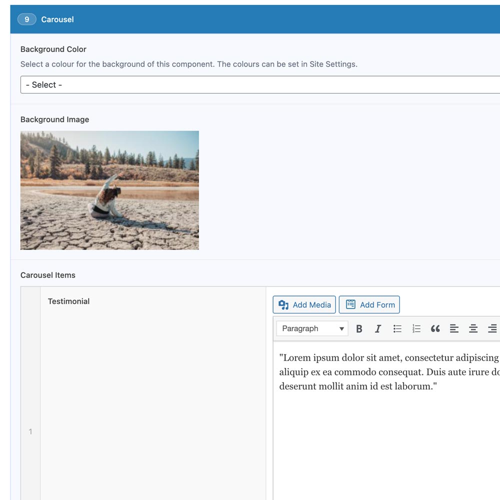
Editing a Carousel component
This component can be used to showcase testimonial quotes, as many as you like.
Expand the section and you will see the optional content areas which are labelled:
- Background Color
you can change the background color of the whole strip. - Background Image
you can add a background image to the whole strip, this will override the background color. - Carousel Items
these are the individual quotes.
Click here for more information on images.
Then within each Carousel Item area you will see the optional content areas which are labelled:
- Testimonial
a text area for your quote. - Author
a text area for the author of the testimonial.
On the bottom right with will see an "Add Testimonial" button to add another row.
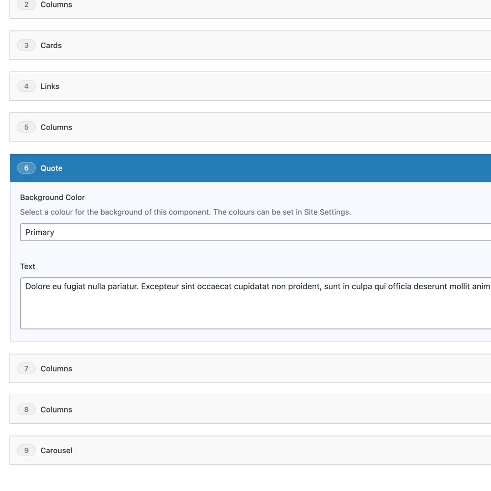
Editing a Quote component
This component can be used to break up a page with a motivational quote.
Expand the section and you will see the optional content areas which are labelled:
- Background Color
you can change the background color of the whole strip. - Text
a text area for the quote.
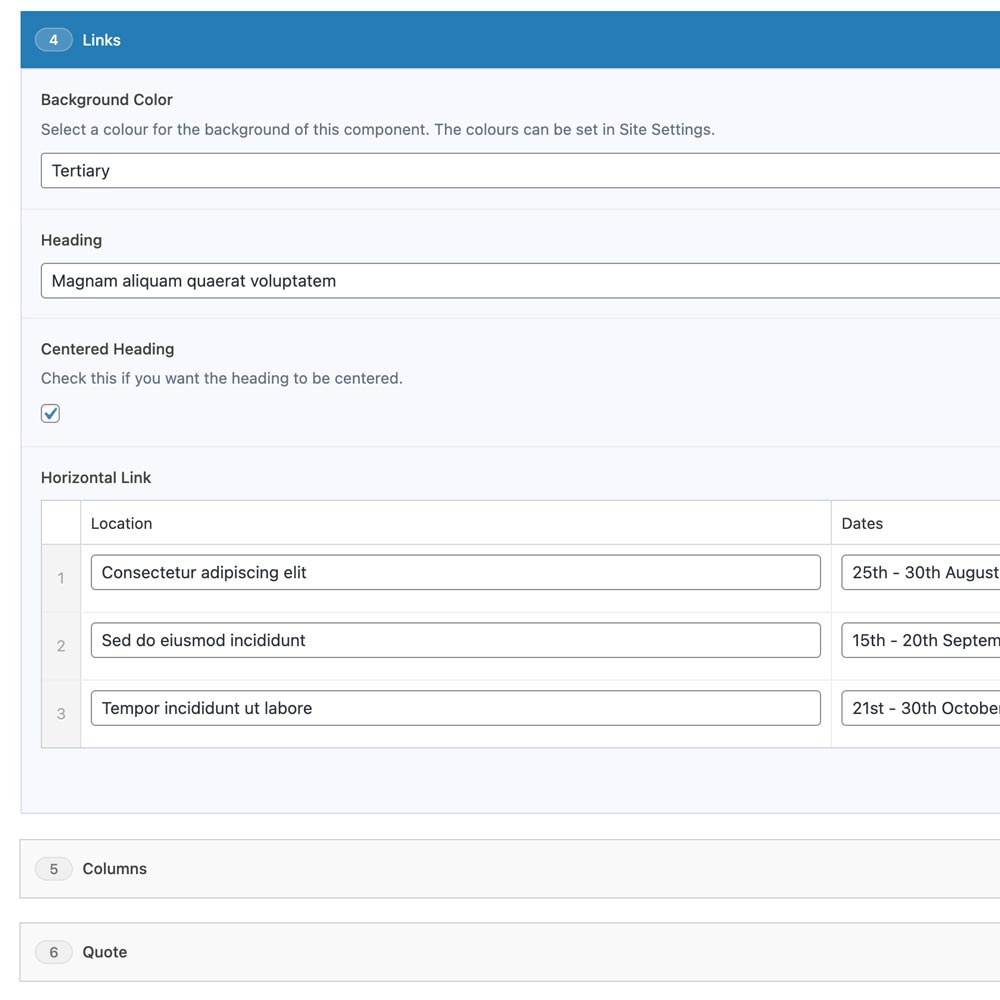
Editing a Links component
This component can be used to list events or any content list where you might need a button alongside some text. It's currently set up for 3 columns, 2 of which are text based and the 3rd is a button.
Expand the section and you will see the optional content areas which are labelled:
- Background Color
you can change the background color of the whole strip. - Smaller Column
unchecked this will make the cards fill the width of the browser, checked and the width will be smaller. - Heading
the main section heading. - Centered Heading
the title is left aligned by default, this centers it. - Horizontal Link
the links themselves, you can add as many as you like.
Then within each Horizontal Link area you will see optional content areas which are set up for location name and dates but you can you any content you wish:
- Location
a text area. - Dates
a text area. - Link
a link that will link the whole hero area to another page, another part of this page or to an external link.
On the bottom right with will see an "Add Link" button to add another row.
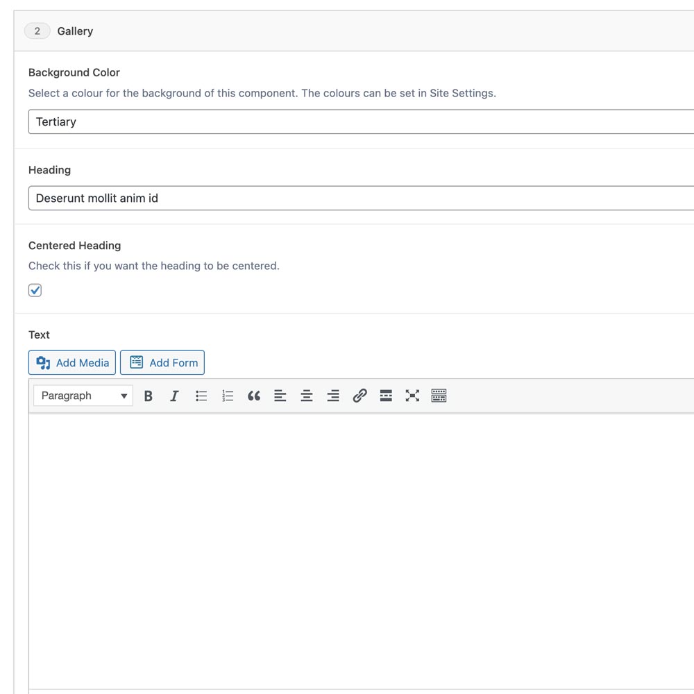
Editing a Gallery component
This component can be used to show images in a grid, as many as you like.
Expand the section and you will see the optional content areas which are labelled:
- Background Color
you can change the background color of the whole strip. - Smaller Column
unchecked this will make the cards fill the width of the browser, checked and the width will be smaller. - Heading
the main section heading. - Centered Heading
the title is left aligned by default, this centers it. - Text
a text area. - Gallery
add image button lets you upload an image, you can add as many as you like.
On the bottom right with will see an "Add Image" button to add another row.
Click here for more information on images.
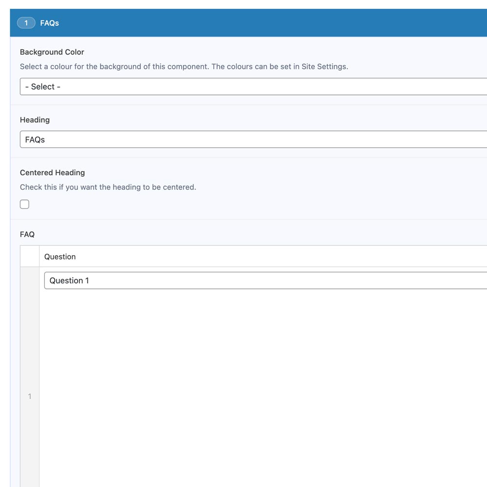
Editing a FAQs component
This component can be used to show a list of frequently asked questions and their answers, as many as you like.
Expand the section and you will see the optional content areas which are labelled:
- Background Color
you can change the background color of the whole strip. - Smaller Column
unchecked this will make the cards fill the width of the browser, checked and the width will be smaller. - Heading
the main section heading. - Centered Heading
the title is left aligned by default, this centers it. - FAQ
add image button lets you upload an image, you can add as many as you like.
Then within each FAQ area you will see the optional content areas which are labelled:
- Question
a text area. - Answer
a text area.
On the bottom right with will see an "Add FAQ" button to add another row.
Clients powered by this our templates